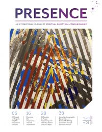
Web-Exclusive Interview with Cristina Mejía, Martha María Tobón, and Matt Whitney
Video Transcript
Matt: I’m here with the designers for our Revista Presencia redesign, Cristina Mejía and Martha María Tobón. Cristina and Martha it’s so good to join you both. I love how Zoom can connect us in this way and allow us to talk and see each other. It still feels very novel and magical to me. It’s good to see you both. Thank you.
Martha: Thank you so much.
Matt: So Cristina, you are a spiritual director, you’re a member of SDI and also a graphic designer. Can you share a little bit about your background in those fields?
Cristina: Yes, definitely. My two loves. I’ve been doing graphic design, specifically editorial design, for 30 years. I’ve had international experience, with bilingual publications mostly. So it’s always been my passion and I love it. And when I saw Presence, when I got involved in spiritual direction, which was almost five years ago, I just loved the magazine. And, I always had this dream of being able to redesign it. So this is definitely my dream come true to be able to do graphic design and do spiritual direction together.
Matt: It’s so cool that both of these fields for you really came together. Martha, can you tell us a bit about your background?
Martha: Yes, I’m also a graphic designer with more than 20 years of experience. I worked for a while in advertising agencies, but graphic design was my passion. I’m very happy to work on this project with her and to feel the passion that she has with the subject (of spiritual direction). She loves it and I can feel it. And that makes my work a lot easier.
Matt: Cristina, when I saw your portfolio and the work that you’ve done, it’s apparent you both have worked on some very high profile projects. Can you share a little bit about that?
Cristina: When I was in college, my dream was to be an art director for ELLE magazine and I was able to do it when I moved to Colombia. That was my dream job and it turned out to be not so great once I was doing it. But I did work in a lot of magazines here in Colombia and the U.S. I was able to work for General Mills in different bilingual magazines like Vista, and for the Latino population in the U.S. For the past maybe four years, I’ve been able to work with different nonprofits and more and more I’ve been able to work with people working in the spiritual world. I’ve been working for the Sisters of Mercy. I was able to do their magazine in Spanish for them. I’m working with Catholic Relief Services right now. We’re working together on a lot of projects for them. So it’s just amazing to see that all the work, all the deadlines, all the pressure, we’re doing it to communicate a message that’s going to be worthwhile, that’s going to change the world, that’s going to move goodness forward, and bringing the world together. I see what we did at SDI as a way of unifying the world, the spiritual world. I don’t know if that answers your question.
Matt: Yeah. I bring it up because I just want people to know that you two are at the top of your game – you are both profoundly experienced and amazing graphic designers and artists. Cristina when I saw your portfolio I was like, oh my gosh, this is beautiful work – there’s no way we’re going to be able to make this work for our little spiritual direction magazine! It is such a gift that you offer it to our organization and to others. So thank you.
Cristina: Thank you. That’s nice.
Matt: Let’s talk a little bit about the redesign process. How did you begin on this journey of thinking about how to make Presence look the way that it does now?
Cristina: Okay. Well, Martha, I don’t know if you want to chip in, but we can start with the logo that was changed. As we know, Presence is part of an umbrella of SDI, which is the bigger brand. So we needed to be really faithful and loyal to the brand. So it was definitely a challenge to bring something that looks new, but always keeping it under the umbrella. So I think that was one of the things that we worked really hard on, the (Presence) logo. And I do love that we have two logos for the journal. For the first (purple) one that we use, it has the background of the universe, the stars, and you go in, there’s a shadow inside. So it’s so much more about that presence that we bring to the people that we meet, how we go inward. So it’s the cosmology and the inward – there are two worlds together. So I think the logo really represents that. (And), it has the colors and gradation of the purples of SDI. Then the other one is just white. So it stands very white, pure, beautiful. And it has this radiance of purple is the main color of SDI. As we know, purple represents divinity. And always keeping the stars of SDI. We wanted to communicate that presence, that stillness, that space to breathe. I don’t know if you want to share something, Martha, of your thinking also.
Martha: Well, we have two logos, but it’s really one logo and two different ways to use this logo. Remember we were talking about movement and constant change and we do that with the logo. We are going to change this logo with every issue we change it. I think that’s very special. It’s the same logo, just two different ways to use it, two meanings. Very deep, deep meanings.


Matt: Yes. We work with a lot of paradoxes here, where we say presence is here and now, but we don’t always see it. The challenge of being a designer is, how do you illustrate that? How do you illustrate something that is visible yet invisible? Right in front of us, but (seemingly) very far away. Very intimate and close, but also transcendent and is in everything. Working in those kinds of paradoxes, it’s something that I’m always challenged to do as creative director here. But I imagine for both of you…you understand how we live and work with paradoxes as spiritual director, but designing for that is hard!
Cristina: Yes. It was hard. It took us longer than usual because we’re like, this has to be perfect. We wanted to capture that essence.
Martha: But is was such a pleasure, wasn’t it? I mean, we enjoy it. Every single part of it, we enjoy it. Actually, there was a point we couldn’t stop.
Cristina: We had to stop.
Matt: I know that feeling.
Martha: It was amazing. It was amazing. We loved it. We loved it.
Matt: Yes. It’s obvious just the thought and care you put into the logo. I think I saw at least 20 versions of it, speaking of not being able to stop.
Cristina: I know.
Matt: Rev. SeiFu and I really did a deep dive into them, and we were talking about the concept of presence and how it manifests in our lives, and which of your offerings best embodies that essence. I just want to share that. It just was a very well thought out, very well articulated, very deep engagement that you brought to this.
Our readers will notice and you’ve put a lot of care into this, with the interplay between text and image. Can you talk about that a little bit?
Cristina: Yes. Well, it’s a journal, so it’s always been pretty type-heavy, but you also have such beautiful images that you work with. You have artwork from different members and we also introduce a lot of photography that would speak by itself. Just to communicate those abstract concepts that we were talking about. I see it as layers. We had different layers. Of course the typography had to be legible and we worked with different families so we could actually have a lot of flexibility and always keep it moving. Because it is evolving. Our community is changing, growing, evolving, it’s getting more international. So that was the concept: be legible, meet the needs of our audience, but also reach for younger spiritual directors and people outside of our community who also are learning about it.
So I was always thinking, and I know we thought about it a lot, about layers: how to work with the lines, the graphics, and illustrations. Also with backgrounds having different colors, and photography and artwork. It’s so rich in terms of imagery, so rich, and that makes it beautiful. And I think that’s also such a big part of spiritual direction. How we gaze at beauty and we find it in nature and we wanted to bring that in and work with a lot of white space around all the images, all the topography so the reader would have that space to actually breathe and be present.
Martha: And to stop: to be able to stop and breathe, and interiorize that powerful message. To have an experience while you are reading. To be able to have the space to have an experience. To feel it.
Matt: You’re speaking the language of my heart, which is making things that are elegant and beautiful and accessible, and also cause us to stop, to pause, to take a breath and just be with an image, be with an artwork, be with a particular word in a callout. (To notice) something that stands out and brings us in to a contemplative moment in the magazine.
Cristina: Yes, it’s so needed right now. I think we just need it so much now in our world, the spiritual companion, the contemplative view. It is really important work, very important for us to live that way as directors, as people in general. We’re so bombarded with information even in the spiritual world, we can be so bombarded with content, so I think it’s very important that when we get it, we are contemplative about reading it and taking the time. You don’t have to read it in one sitting. You want to go back to it, you want to drink some tea, you need to really digest it and enjoy it. Have an experience like you said Martha.
Martha: Yes. To have a personal, enjoyable experience, a unique experience.
Matt: That is our hope for readers, that they’re able to have that contemplative experience and see themselves as they are reading. This is your journal. It’s the journal that (represents) our community, the voices in our community, talking about the work of spiritual direction, talking about being in spiritual companionship and finding new contemplative paths and avenues and discoveries. My hope is just that you see yourself in the journal. That you see yourself more clearly, that it almost serves like a mirror to the really important work that you do.
Do either of you, Cristina and Martha, have anything else you would like to share with our community about the magazine, about the process of designing it, or any other hopes?
Cristina: Go ahead, Martha.
Martha: Well, we hope they love it as much as we do. We hope their experience will be more personal, like I said, enjoyable. I just hope they love it. I just hope they love it because we did enjoy it and it’s our little baby.
Cristina: I think what I’d like to add, what I love so much also about our community, is just how diverse it is. I think we worked hard to make it very unique to SDI, but also very diverse. So anybody from any kind of background can feel like they’re part of the community, it’s their journal, their language, not only in words, but in images were also spoken to them. I think that was something that was very much in my heart to keep it very diverse and unified at the same time.
Matt: It just is so obvious and evident the amount of care that you both put into this project and bringing your gifts and your talents to bear in making this such a beautiful offering. We all see it and I am deeply grateful and forever indebted to your efforts and for your giving of yourselves in this project. Thank you so much.
Cristina: Well, thank you for the opportunity. Thank you so much.
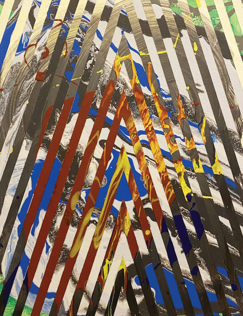
"Double Positive"
— Wayne Adams
This Article Appears In
AN INTERNATIONAL JOURNAL OF SPIRITUAL DIRECTION + COMPANIONSHIP
Vol. 28 | No. 1 | MARCH – 2022
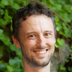
Author
Matt Whitney
is a multidisciplinary artist and educator who grew up in the Pacific Northwest and lives in Seattle. He works between drawing, painting, photography, video, design and illustration. He is the host of SDI’s weekly podcast, Encuentros en SDI, que participa en conversaciones en torno a la dirección espiritual, la práctica contemplativa y el soporte espiritual. También trabaja como director espiritual y está certificado por el Instituto de Entrenamiento de Orientación Espiritual.
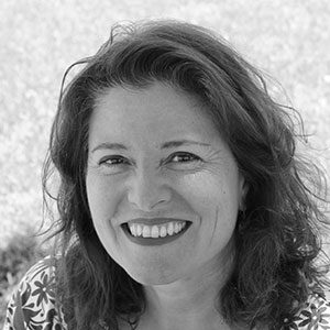
Designer
Cristina Mejía
has 30+ years of experience in the graphic design industry, primarily in international editorial design for commercial organizations such as ELLE, Impremedia and General Mills, to social organizations such as the National Immigration Forum and Catholic Relief Services. Cristina is a certified Spiritual Director from the Hesychia School 2019, a member of Spiritual Directors International (SDI), and focuses on the evocative method in her practice.

Designer
Martha María Tobón
is a Colombian graphic designer and art director with more than 25 years of experience in Graphic Design and Art Direction, who has worked for many years in Advertising Agencies and Graphic Design studios in Bogotá and London.

